
The stripes have a story: how MexiGo got its look
If you've walked past our Aldea Zama store, you've seen it before you read a single word: three stripes — brown, amber, orange — racing across the wall, crashing into a big round GO. People photograph the storefront more than the bikes. We take that as a compliment.
It started with a feeling, not a logo
I was born in the eighties, and the logos I grew up with never left me — Atari, Kodak, Nike. That era when a logo was a shape you could draw from memory with three colours and a steady hand. When it came time to give MexiGo a face, I didn't want another palm-and-script beach logo; I wanted something that belonged on that shelf.
We worked with designer A J Wright, and the brief boiled down to one word that was already hiding in our name: go.
The other half came from a truck
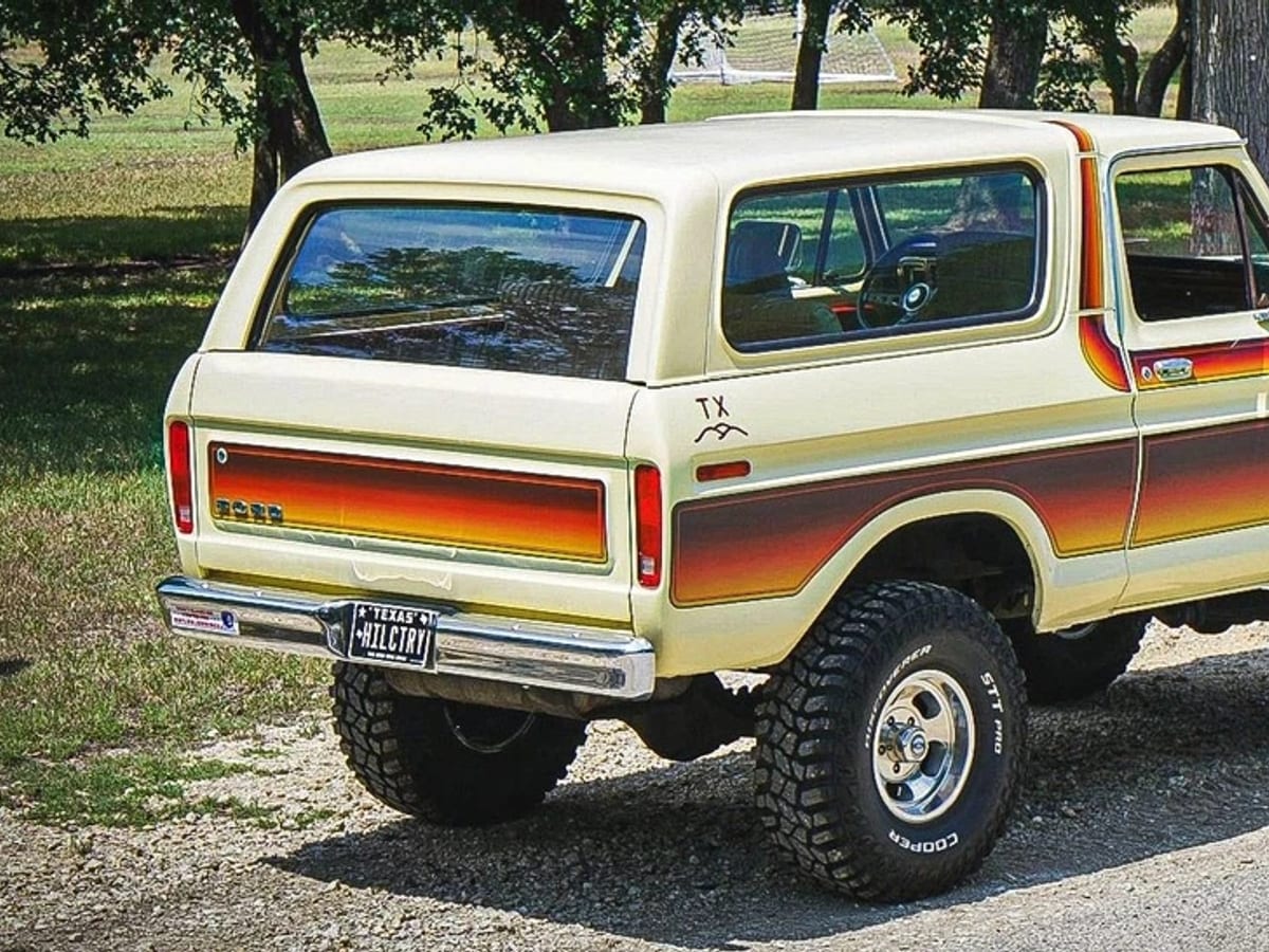
The logos were only half of it. The other half was a Ford Bronco — the late-seventies, early-eighties ones, with the factory decal stripes running the whole length of the body.
Ford called that option the Free Wheeling package, and one of the factory colourways was orange, tan and crème. That is near enough exactly where we ended up, so I am going to take it.
It matters more than it sounds, too. Our stripes are not racing stripes off a sports car. They are off a truck built to be driven somewhere dusty and come back fine — the kind of thing you point at the beach, the jungle and the cenotes without thinking twice. That is a far better description of what we rent than anything with a chequered flag on it.
The person who actually made it
I had been following A J Wright for a few years before I ever messaged him. Not because I was not ready to have a logo — because I was not ready to have that logo. I wanted to wait until MexiGo was at a point where I could properly invest in a designer that talented, rather than ask someone that good to work small.
When I finally did get in touch, my brief was embarrassingly vague. It was close to one sentence: retro, bright, and with 1970s–80s Ford Bronco, 80s Nike, Kodak and Atari logos.
That was it. That was the whole thing. The only colour I gave him was mango.
What came back was everything I had asked for and a good deal more than I knew how to ask for. He took four references with nothing in common — a truck, a sportswear brand, a film company and a games console — and found the thing they actually shared.
Which, once he pointed at it, was obvious: they are all bands of hot colour laid side by side. The Bronco decal running the length of the body. The stripe down the side of a Kodak film box, blue into purple into red into orange. Nike’s block set on a slant so it looks like it is already moving. Four completely unrelated things, all doing the same trick.
That is the whole logo, really. He did not blend four references — he found the one idea underneath them and built us something that belongs beside them instead of copying any of them.
I genuinely could not have been happier with how it turned out.
Where this is going
A logo is not a brand. I know that. But it is the first thing you can point at.
This was the first step towards what I actually want MexiGo to be, which is bigger than a rental shop: a cultural movement Tulum needs — something local, with a point of view, that is here for the town and not just for the season.
The stripes are only where it starts.
Why stripes?
Speed lines are the oldest trick in the book — they're how a kid draws "fast". Adam leaned into that instead of fighting it: the three lines stream out of the wordmark like a bike that's already left. Look closer and the E in MEXI is built from the same stripes, and in the short version of the logo the stripes become the E next to the G — our little EG monogram that marks helmets, keyrings and corners of things.
Why those colours?
One word — mango — and Adam built a whole palette out of it. It is pure Tulum afternoon: brown like the jungle roads, amber like the heat, orange like the sun an hour before it drops. It's also unapologetically retro — the era when bikes were how everyone got everywhere, which is more or less our mission statement for Tulum.
The store is the logo
The best decision of the whole project: not keeping the brand on paper. The stripes run across our counters, around the walls, along the benches. The building is the business card. When people say "the orange bike place" — that's the brand doing its job.
Watch it come together
Adam filmed the process — sketches to stripes to storefront. It's 60 seconds and genuinely fun: